

500k for a dot… or is it?
Source: GOV.UK brand guidelines
The logo that everyone is talking about, was it worth the cost?
You’ve probably already seen it, right? The UK Government’s new brand for its website, app and social media presence. The refresh on the brand was to create something that worked in today’s marketing.
You’re probably asking why they changed it. This is a question you will have your own opinion on, but this article may give you a different perspective on the reasoning.
GOV.UK’s new logo takes on a new colour palette with a bold blue backdrop, adding a vibrant teal dot. This graphic device is more than just a dot. It’s the start of a new feel for the brand. It allows for a softer approach to advertising from the Government.
If the news is anything to go by, the public reaction is “Over half a million pounds… for a DOT” This may be a little unfair to the design agency that created the concept.
Why did GOV.UK need a refresh?
GOV.UK is more than a website; it’s an entire ecosystem.
For over a decade, Gov.uk’s black-and-white identity has been a symbol of clarity and authority, a no-nonsense, minimal design that worked beautifully on the web.
But GOV.UK has grown into a vast digital platform with
- A Mobile App
- A Digital Wallet
- A Social Media presence
- As well as countless public digital services
That minimal design started to show its limits. The need for stronger accessibility, consistency across channels, and a design system that works just as well on mobile as it does on desktop became impossible to ignore.
Colour That Connects
Black and white was built for the web, not a multi digital world.
The black and white branding was a clean no nonsense design when it was introduced in 2012. It brought together lots of clashing departments under one clear brand. Making Gov.uk instantly recognisable, Minimal and Official.
But that strength became a limitation. Black and white looked crisp on a desktop site, yet fell flat on mobile, app icons, and social media. In dark mode, the brand virtually vanished. It was a system born for browsers, not for the ecosystem GOV.UK has become.
Accessibility At Its Core
The new colour palette puts accessibility at its core, not as a checklist but as a design principle. Every hue and contrast was tested for clarity and inclusivity, ensuring GOV.UK’s colours work seamlessly across web, app, and social. Crucially, colour is never used as the only way to convey meaning, because clarity shouldn’t depend on how someone sees.
Sticking with Blue!
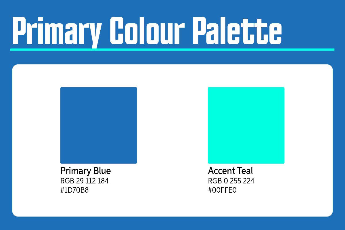
GOV.UK’s decision to Make its existing Blue its primary colour reinforces the sense of familiarity and trust across every platform. Blue has always been the colour of trust calm, confident, and dependable and. From the blue header on the website and app to branded banners on social media, using one consistent colour story helps build recognition and strengthens public trust.
The Accent Teal sits perfectly alongside it, a fresh, modern contrast gives the palette energy without undermining the professionalism of the brand. Together, these colours create coherence across all channels, ensuring GOV.UK feels familiar wherever users encounter it. Designed for today’s digital world bright enough to pop on social, clear on the web, and balanced for accessibility in both light and dark modes.
Source: GOV.UK brand guidelines
Inspired Typography
Typography has always been GOV.UK’s quiet superpower. The use of GDS Transport, inspired by Britain’s road signs, ensures information is clear and universally understood. The refreshed typographic system refines that legacy. Adapting it for readability, consistency, and accessibility in a truly digital-first world.
A Typeface that is responsive, legible and inclusive guides users effortlessly through content. Whilst maintaining the authority Gov.uk’s brand is known for. In short, it’s typography designed not to impress, but to inform.
The Logo
Yes, the logo change has a purpose. That small repositioned dot, the refined crown, and subtle adjustments to spacing aren’t cosmetic; they’re systematic. Together, they create a logo that works in every size, across every platform, and within every channel, from app icons to high-contrast accessibility displays.
The update ensures GOV.UK’s identity remains clear, consistent, and accessible everywhere it appears. Because in an ecosystem this large, design is more than aesthetics and looks; it’s infrastructure.
More than “just a dot”?
Designed to guide users through content, the dot acts as a graphic device and visual anchor across GOV.UK. Through graphics and motion, it helps engage and orient users, making navigation more intuitive. it’s a strategic design choice, part of a system built for accessibility, consistency, and trust.
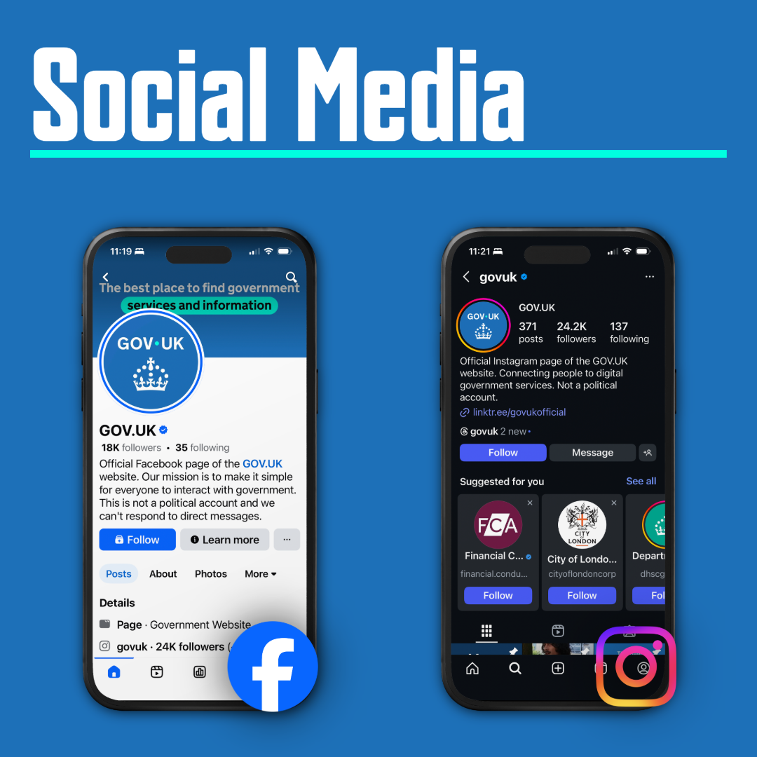
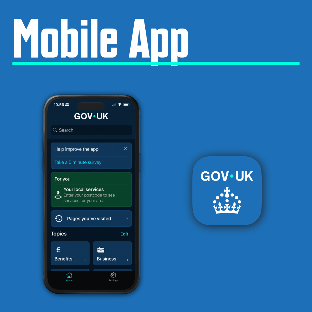
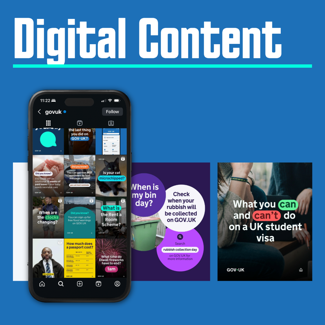
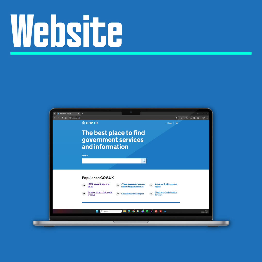
Sources: GOV.UK Instagram Page: https://www.instagram.com/govuk/?hl=en, GOV.UK Facebook Page: https://www.facebook.com/p/GOVUK-61556546057412/, GOV.UK Mobile App: https://www.gov.uk/guidance/download-the-govuk-app
What Does This Mean For Users?
For most users, the changes will be subtle but impactful. Navigation remains familiar, but the site feels more modern and approachable. Improved contrast and clearer fonts make information easier to find and understand, particularly for those with accessibility needs.
Organisations and teams using GOV.UK services will benefit from updated branding assets and guidance, ensuring consistency across all communications.
Moving Forward
The update ensures GOV.UK’s identity remains clear, consistent, and accessible everywhere it appears. Because in an ecosystem this large, design is more than aesthetics and looks; its infrastructure.
In summary, GOV.UK’s refreshed branding sets a new standard for public sector design, balancing tradition with innovation. Whether you’re renewing a passport, checking tax information, or accessing public services, the new look is designed to make your experience smoother and more engaging.
Whether it was worth the £532,000 price tag that i will leave up to you. But make no mistake the work that went into the new brand wasnt a two minute job.
Resources:
Brand Guidelines: https://www.gov.uk/government/publications/govuk-brand-guidelines
Changes to GOV.UK: https://www.gov.uk/guidance/changes-to-govuk
We’d love to hear from you
Simply fill out the form below to arrange a free consultation.

How does colour choice impacts your mood and brand identity
Colour is one of the most effective tools available to [...]
500k for a dot… or is it?
The logo that everyone is talking about, was [...]

The Launch of the Twisted Money League
The Launch of the Twisted Money League We are excited [...]


